A store opens once. The decision to open it happens months earlier.
A retail expansion team's job is to keep answering one question for every market they operate in: where should the next store go. That decision draws on several things at once — how much of a city is already covered, who else is operating nearby, what a location's footfall and spending power look like, whether a new store would eat into an existing one's numbers.
None of that lives in one place naturally. It comes from internal store data, third-party demographic and footfall providers, competitor mapping, and an expansion team's own judgment. RetailIQ's job is to hold that in one product, in a shape an expansion team can use to decide.
Every layer of data, on one map
The earlier RetailIQ put a wide range of data an expansion team might want on a single map — stores, competitors, footfall, demographics, recommended sites — as switchable layers over the same city view.
That also meant the interface was organized around what data existed, not around what someone was trying to decide. Opening RetailIQ didn't put you closer to an answer on its own. It put a lot of information in front of you, and left the assembling to you: which layers to turn on, in what order, and what to conclude once you had.
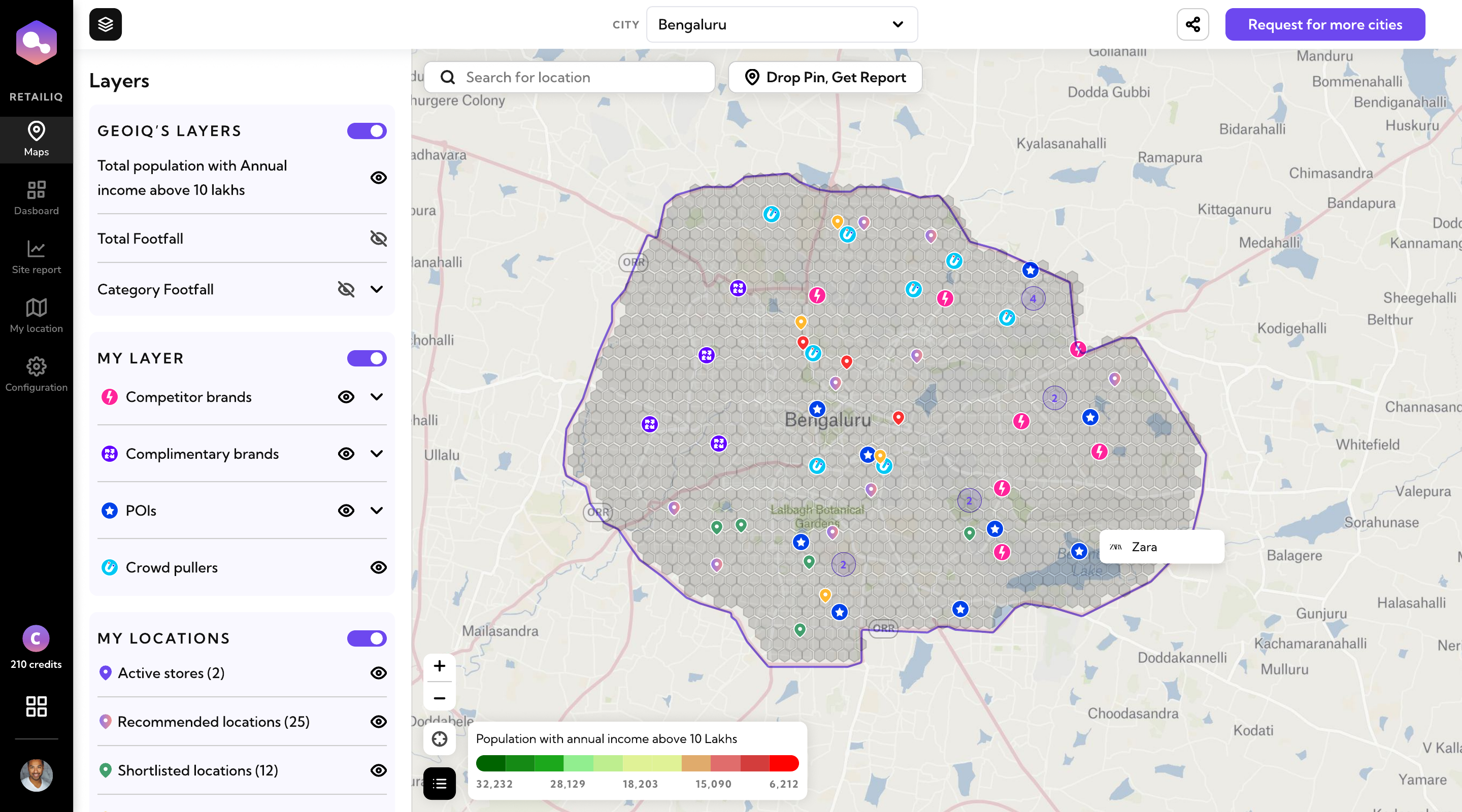
Every dataset RetailIQ had, available at once. Reading the map was the user's job.
The product knew a lot. Users still had to assemble the answer.
The redesign isn't a visual refresh of the old map. It's a change in what organizes the interface.
Earlier, the interface was organized around the datasets available — layers, stores, footfall, competitors, points of interest, recommendations. Someone had to decide what to turn on and how to combine those signals into an answer.
Later, the interface became organized around the expansion workflow itself: discover, understand coverage, evaluate, compare, progress. The datasets didn't go away — they still existed, in full. What changed is that each one now appears closer to the stage where it's actually useful, instead of all at once on a single screen.
That distinction runs through everything that follows in this case study: every screen after this one exists because of where it sits in that workflow, not because of which dataset it happens to show.
I translated that feedback into a different information architecture — moving from a single dataset-organized map to a sequence of workflow-organized moments.
- Layers
- Stores
- Footfall
- Competitors
- POIs
- Recommendations
Organized by dataset — the user chooses what to look at, and in what order.
- Discover
- Understand coverage
- Evaluate
- Compare
- Progress
Organized by decision — the same datasets, surfaced when they're relevant.
You either don't have a location yet, or you already do
The new workflow starts by splitting on that. Discover asks RetailIQ to generate candidate locations from expansion context. Validate skips straight to a specific point — drop a pin, or search an address — and RetailIQ evaluates it directly.
On the Discover side, an earlier version of recommendations could stop too high up: it could tell you a city was worth expanding into and leave it there. That's true, but it doesn't say where in the city, or whether existing stores already cover that part of it. Generate Recommendations now asks for expansion context up front — existing footprint, competitors already nearby, complementary brands worth being close to — before it produces anything, so the output is a set of specific candidate locations shaped by that context, not a market-level suggestion someone still has to break down by hand.
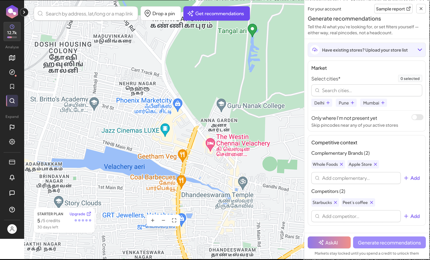
Start from expansion context, not a blank map or a city name.
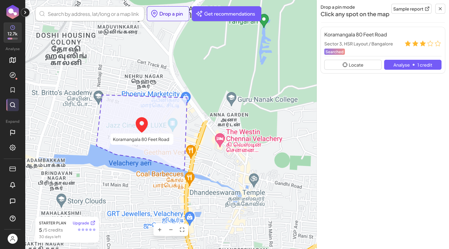
Already have a location. Go straight to it.
An empty-looking area on a map isn't the same as an open opportunity
This isn't a required stop between Discover/Validate and deeper site evaluation — it's its own analysis, reached for whenever the question is about coverage rather than one specific site. Whitespace doesn't mean an area with no store icon on it, either. Catchments overlap — a spot that looks uncovered on the map can still sit inside the pull radius of two or three existing stores, which makes it a smaller opportunity than it first appears, or not really an opportunity at all.
Plotting locations on a map alone couldn't show that. It could show where stores already were, not how much of the surrounding market each one was reaching, or where overlaps left a market genuinely thin.
The whitespace view brings active stores, shortlisted locations, recommended locations, and catchment assumptions into the same picture explicitly, with catchment type and radius controls to adjust how coverage is being read. Catchment overlap becomes explicit when evaluating whitespace, rather than left for someone to infer from a plain map. It's a way of reasoning about coverage, not a claim of mathematical precision — the assumptions behind each catchment are visible and adjustable, not a black box. It works even without existing stores nearby: a brand entering a market for the first time can use the same view to see where a competitor already has presence, and decide where to enter close to that footprint or deliberately away from it.
I designed this redesigned whitespace experience, informed by real feedback about how hard it was to read existing brand presence and overlapping catchments on the old map, and how often apparent whitespace shrank once that overlap was actually considered.
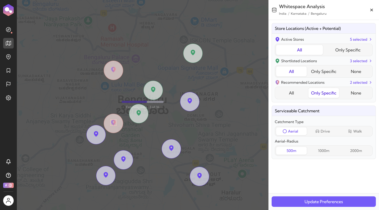
Looks open on its own. Once the catchment radius is drawn, it isn't.
As a location becomes a more serious candidate, the depth of analysis increases
Once somewhere looks promising — surfaced through Discover, confirmed through Validate, or found via whitespace — it moves into a structured overview: sector and market detail, predicted revenue, population, affluence, market density, nearest store, and brands in catchment, organized under tabs for detail, requirements, properties, nearby stores and markets, comments and visits, and change history. From there, the depth of analysis increases as a location becomes a more serious candidate.
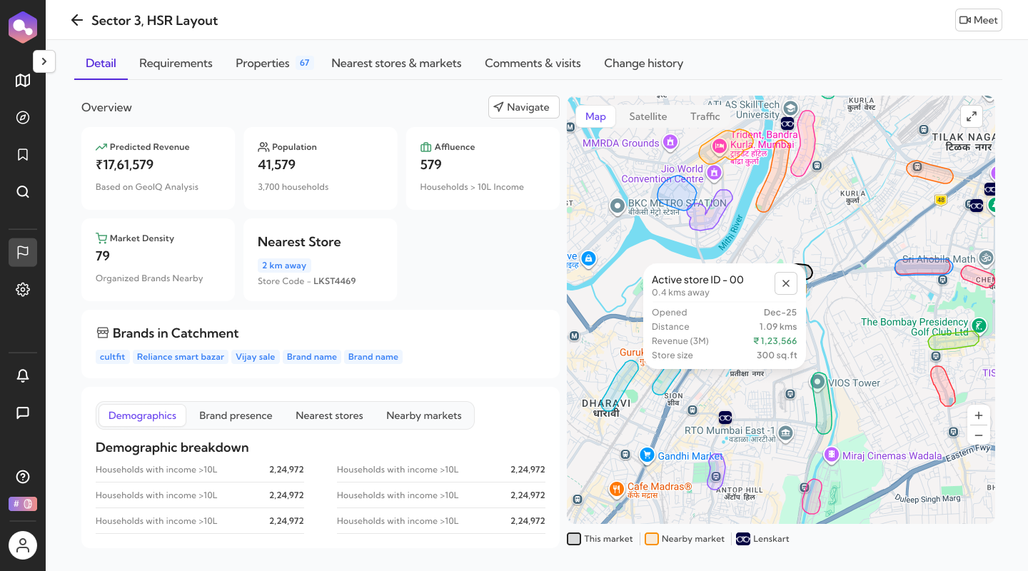
Detail, Requirements, Properties, Nearest stores & markets, Comments & visits, Change history — the overview is the entry point into all of it.
The site report goes deeper into the same ground the overview already touched, module by module. Four of the strongest:
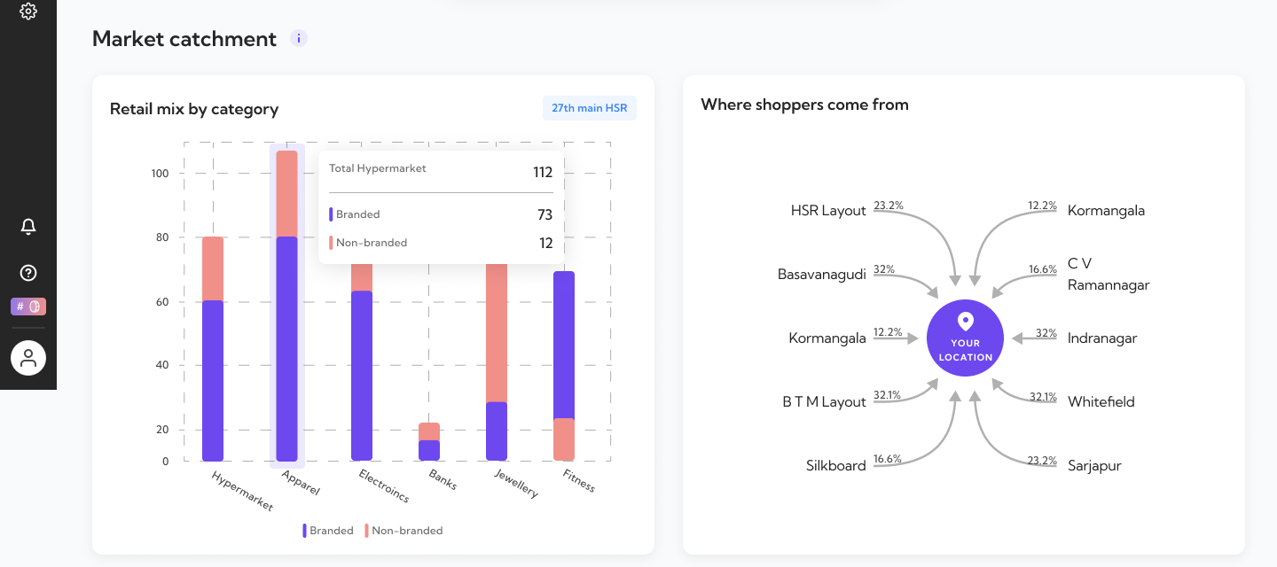
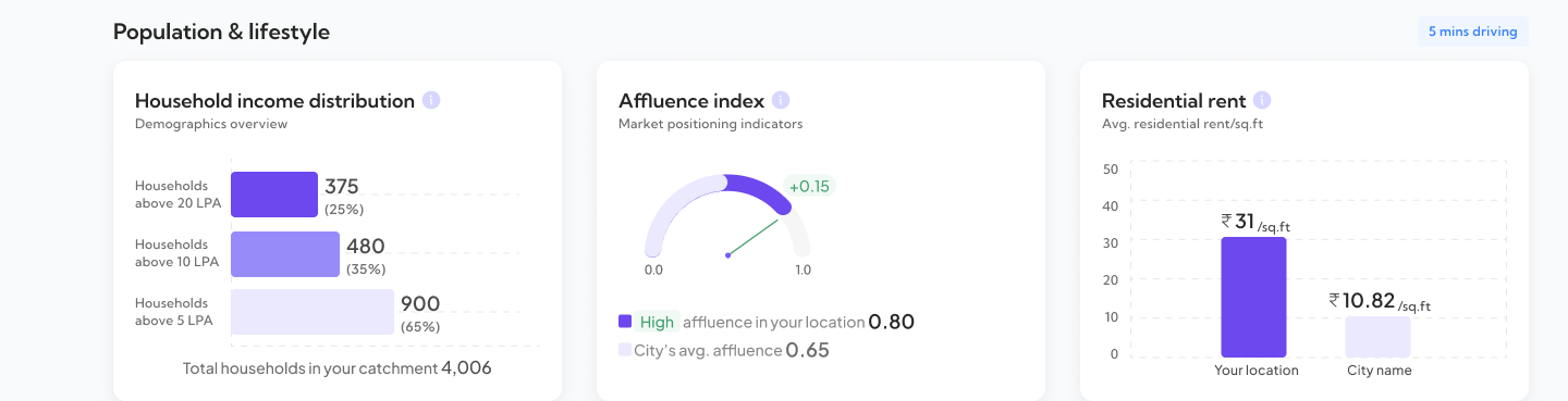
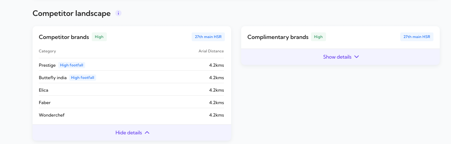
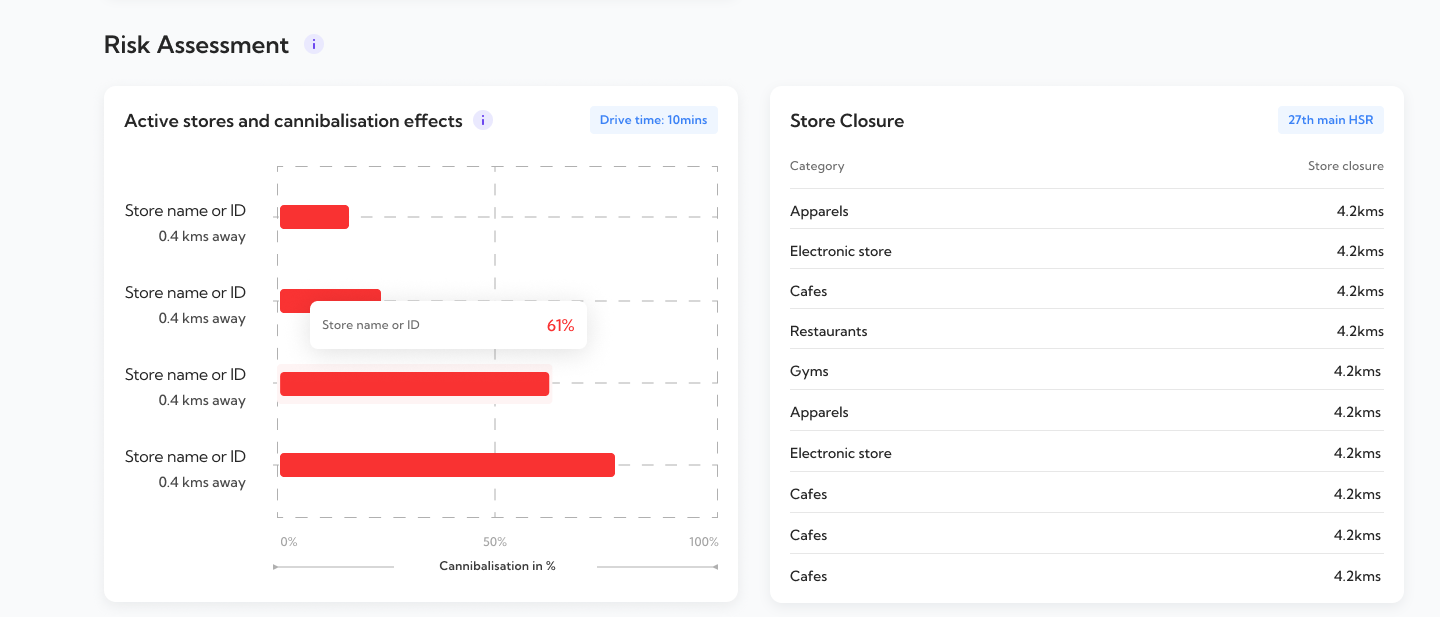
Comparing two sites only works if they were evaluated the same way
The obvious description of this screen is that it lets you compare two shortlisted sites. What makes that possible is the more important point: every location in RetailIQ goes through the same site report structure — the same modules, the same categories, in the same order — so two locations can be placed side by side and actually mean something.
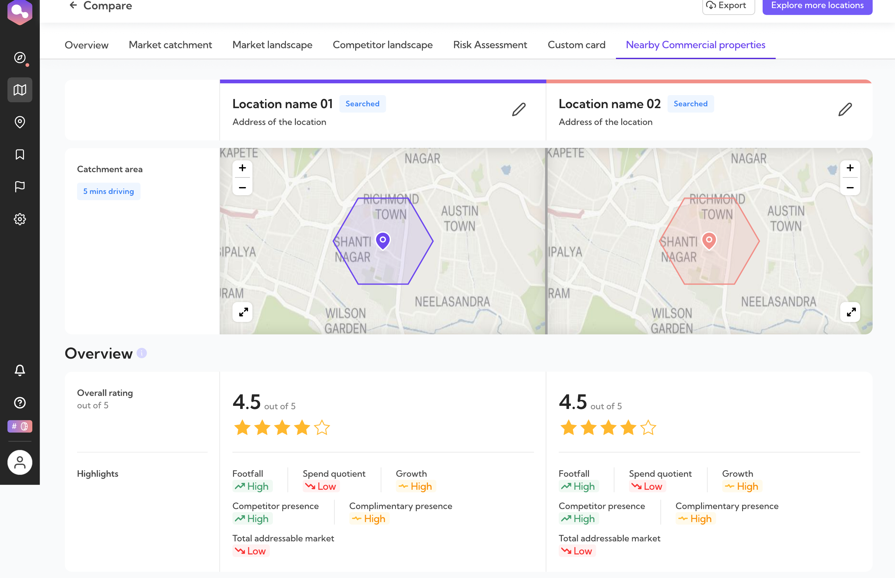
Same categories, same order, on both sides. That's what makes this comparable at all. — View full comparison
After a site looks right, someone still has to move on it
A shortlisted location doesn't stop being live once the analysis is done. It gets visited, discussed, owned by someone, and tracked through whatever stages come after — sourcing the property, negotiating, closing. Markets & Properties is where RetailIQ holds that, kept intentionally lighter than the analysis chapters before it.
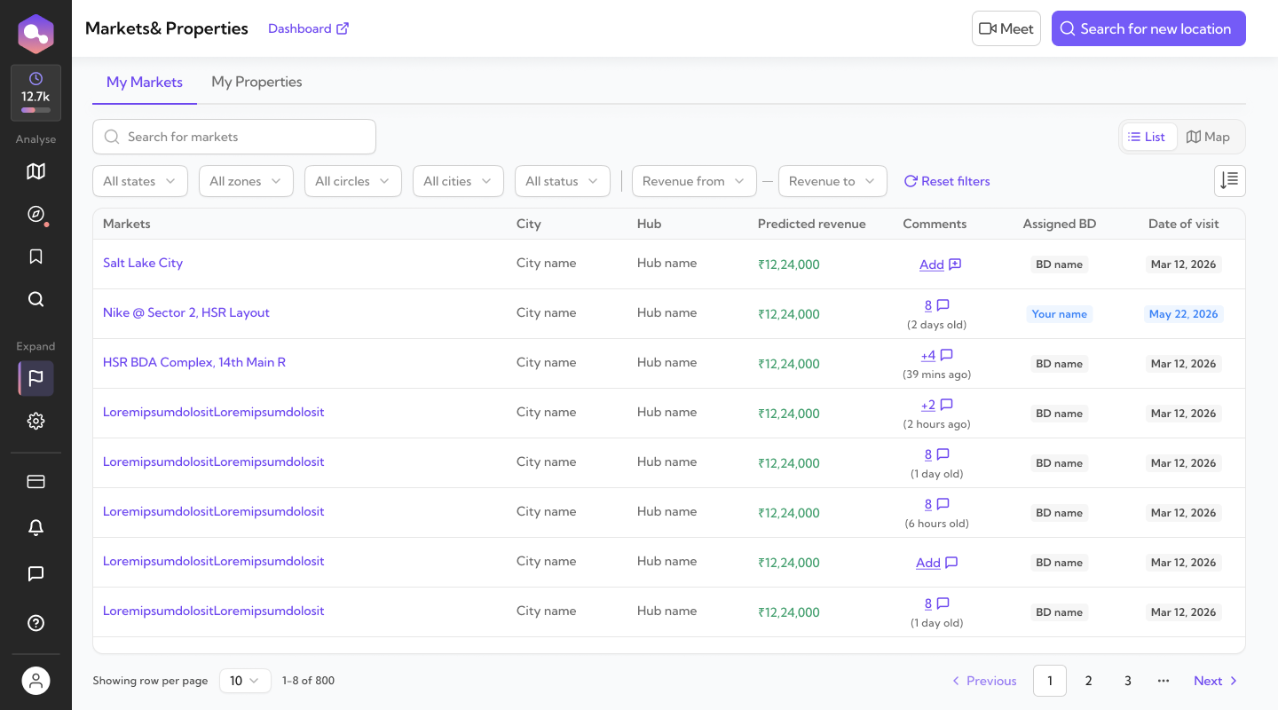
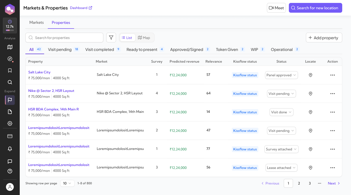
The opportunity keeps a status after the analysis is done — it doesn't just disappear into a shortlist.
What changed was how much work the user had to do to turn the intelligence into an expansion decision
The underlying data didn't change through this redesign — catchments, competitors, footfall, recommendations were all already there. What changed is the order an expansion team meets them in, and what's asked of them at each point along the way.
What changed in the product. The interface split entry points by intent (Discover vs. Validate) instead of one generic map. Every location moved through the same evaluation structure, overview through site report, which is what makes direct comparison possible. Whitespace became something to reason through explicitly — catchment overlap visible and adjustable — rather than something to eyeball on a plain map.
What this enabled for the workflow. The redesigned workflow reduces how much of the answer users have to assemble manually from raw layers. Recommendations start from real expansion context instead of stopping at a city name. Two shortlisted sites can be compared on genuinely equivalent terms. Over time, RetailIQ also brought pieces of expansion work that used to live in separate places — location and site analysis, revenue and affluence modeling, competitor context, rental benchmarking, market and property management, visits, comments, and approval stages — into one system, which cut down the coordination that used to happen around an expansion decision rather than inside it. RetailIQ consolidated a fragmented expansion process and reduced the manual coordination needed to move a property from analysis toward a decision.
- Coordination. Expansion work that used to run across multiple tools and offline coordination now runs through one system.
- Recommendations. Discover moved from a city-level suggestion to specific candidate locations shaped by real expansion context.
- Coverage. Whitespace analysis made catchment overlap explicit and adjustable, instead of left to manual interpretation of a plain map.
- Follow-through. Markets, properties, visits, comments and approvals stayed connected in the same system after the analysis was done.
What I'd revisit. The redesign made information progressively available, but the site report can still feel dense once someone moves into deeper analysis. If I revisited RetailIQ today, I'd push that depth to adapt further — based on who's asking, what question they're actually trying to answer, and how far a location has already progressed in the expansion process. A location just entering Discover and one already through whitespace and into deep evaluation probably don't need the same amount of analysis surfaced at once.